Ever wondered how the next version of Android will look like? Google just revealed major design changes with the Android “L” with a preview that is now available to developers.
Android L follows a new design principle called Material Design where elements in the user interface are treated as 3D objects with paper and ink qualities. This creates life-like smooth and sensible animations.
Let’s start looking at Android L from its lockscreen. Android L automatically determines if the device should just unlock automatically or present a pattern challenge. It takes cues on Wi-Fi network connections, nearby gadgets like your smartwatch and even your voice pattern!
When you land on the Android L home screen, you’ll immediately notice the changes in the navigation buttons which now looks like those in a game controller. The back button is now a triangle, home button a circle and recents a square.
However, the biggest change comes from Material Design. This new principle extends Googles current cards layout with shadows and perspective to produce 3D effects.
 |
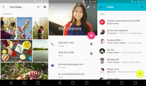
| This is how Android “L” homescreen looks like! |
Material Design automatically applies colors to UI elements based on a picture. It can even colorize the status bar to match the current app.
There’s also changes with notifications that can now appear on the lockscreen and can be swiped away or tapped to open the corresponding app.
While you are in an app, important notifications also appear as Heads-Up Notifications. These are cards that appear at the top of the screen. You can continue playing a game, swipe it away or open it.
Notifications even appear on your Chromebook and when clicked, opens the app in it!
In terms of performance, Google boasts improved Android Runtime, lesser lags, 64-bit compatibility and longer battery life as a result of Project Volta.
Android L Developer Preview is now available so that Android programmers can start creating apps that takes advantage of its new features.

 REVIEW: Pleasing Low-light Portraits and a Sleek Design")